Thursday, November 12, 2009

A Heart Warming Experience...


I have decided to blog about this beautiful and amazing project done by Tim, Shelby, Chandra, and I.........................


Just kidding.

This beautiful poster board was made by Kyle, Cati, Annie, and LaToya. It maps the different kinds of events and activities that the two major art museums of Minnesota; Minneapolis Institute of Arts and the Walker Arts Center. It displays this information with four main colors; a warm blue, blood red, black, and blue... plus the grayscale icons. It displays an image of a city (Minneapolis) with blue lines going into the heart in the center (blue for blood that flows into the heart) and the red lines flow out of the heart. The red lines connect to various events/activities that the MIA and Walker offers.
This is a very informational and effective map, especially for individuals and families who wish to get involved in the arts community of Minnesota; a very important thing, in my opinion, for the future. The map is clear for the most part... the red and blue lines take a few moments to identify their origins and destinations before you realize it is more for an aesthetic purpose. But the lines are important, they lead to the main information of the map, which is the different events. Within the thumbnails of the different events had the logos of the MIA and Walker, some which only is available at one of the locations.
Overall, it is very professional visual information that is very effective and aesthetically pleasing.

Thursday, October 29, 2009

Open-mindedness and Broad Variety of Art...


"Artist's Studio No. 1" by Roy Lichtenstein

This is an oil/Magna acrylic/sand painting on canvas by Lichtenstein, an American pop artist. It is 8 ft. by 10.6 ft. and was completed in 1973. The painting includes various objects in a room, an "artist's studio", which seem random. The items include a couch, plant, arrangement of fruits, telephone, picture frame, paintings, comic pictures, plant, vase/pottery, and a greek-like end table/stand. There are only six main colors used in this painting; black, white, yellow, green, red, and blue. Everything is relatively flat except for the ceiling which is a gray cloudy texture.
Lichtenstein was a pop artist, so he painted images of images. The concept of machine-made things was a common pop theme, hence why his works seem very "perfect" in a sense, and appear to be computer generated (a print). In fact, similar to Warhol, he painted his works by hand. A comic theme is common throughout Lichtenstein's work. He even painted all the small color dots which appear when a comic print is magnified.

I had learned about this piece only a few days before I first saw it in person and felt an overwhelming wave of awe. I didn't stop by it long to interpret it, but looking at it closer now, I see that he includes different forms of art within the whole painting. With the large painting on the far left, I believe he represents abstract expressionism (or painting in general). The telephone refers to modern art, or communication art. The arrangements of fruits represent still-life art. The vase represents pottery. The couch represents furniture design (with it's frilly trim on such a boring, flat, white couch). The painting above the doorway is landscape art. The large donald duck image is comic art. The whole room represents architecture. And the pillar-column like stand on the far right represents classical art. I think he may be showing the different kinds of art which an artist may be exposed to. The artist, seeing something inspiring, "takes" that inspirational subject into the artist's own "studio" in a sense. A metaphor for being inspired, storing the memory of the inspiration, and making art influenced by that inspiration. Although, this thought contradicts the non-variety of pop art.

I watched a video of Lichtenstein painting one of his large paintings, very similar to "Artist's Studio No. 1". I was amazed at the fact that he actually painted them with paint and brushes. It is very similar to Mondrian. The perfection in line and purity in color is simply amazing.

Thursday, October 15, 2009

Floating Between The Heavens and The Earth


"Suaire de Mondo Cane" (Mondo Cane Shroud) by Yves Klein (1961)

When I saw this piece I thought about the Blue Man Group. The color, which is the official color of Yves Klein, is "International Klein Blue". When he started these "body imprints", he was inspired by the sweat imprints made on Judo mats when he practiced Judo. It is obvious that it is imprints of different nude women of various sizes. I am curious as to if it was set on the ground or on a wall or if the height differences are correct? (or did they stand on something?)
Why blue? Blue is a sad color (like they say, "why so blue?") as well as a cold feeling color. The deep blue of IKB makes me think of the ocean. If someone didn't know it was imprints of women's bodies, it might look like a four-legged animal from a front view (thus showing two legs).
I know that Klein also did full-body imprints (head/face and legs included) yet why did he not do so in this piece? It could be detachment from the head and the ground, an absence in the mind and not well-grounded to the earth. The middle-most figure seems to be leaning to the left and suggests a "curious" stance. The figures as a group in height (from the left) goes high-low-high-low-high-low-high. This could add onto being between the ground and the skies as "floating inbetween".
In his other works, it was that he wanted a "sense of the spirit within" and by looking up close to the painting, you can see not only the skin print, but the movements it made and the "marks of movement". Different textures are visible and suggests how the model may have moved about when making her mark. In some senses it is like recording history.
Klein did not touch the piece in the makings (as well as his other anthropometry pieces). He was always the directing hand where he'd tell the models and his students what to do. That suggests a sense of control, or even playing god.
It could be related to an advanced (or mature) version of childish hand-prints. It is messy, like a child's art work. It is similar to the sense that children make their mark with all interest of seeing the results.

Klein also did some minimalism work, his most well-known one being "Le Vide" (the void) in 1958. He was fascinated by the idea of a "void" (derived from a Zen concept) and looking into the void and also getting a sense of the void. In a gallery he exhibited at, he emptied a room except for a cabinet and painted it all white. He created an elaborate entrance to the exhibit, suggesting something phenomenal. With the massive publicity, over 3000 people waited just to see an empty white room with a cabinet. He said it was a "zone of heightened pictorial proto-mystical experience". (fun fact: everything was blue outside the room, the windows, curtains, and cocktails... he put something in the cocktails that made people urinate blue for a week) This had some Dada elements, thus some say he is part of the Neo-Dadaists. Others say he is of "post-modern" era. His work was about the physical experience more than visual.
He also did performances. In 1957, he released 1001 blue balloons for the opening of Iris Clert Gallery.
He has an series in the same nature of this piece called "Shroud Anthropometry" where he would do full-scale imprints of wome. Anthropometry is the measuring of a human body...

Thursday, October 8, 2009

Curious Silver Star...

"Silver Star" by Mark Handforth

At Midway Contemporary gallery in North Minneapolis, MN hangs a giant 98x98x21 in. silver star. It is made from steel and painted with enamel (“The Secret Life of Objects.”). As you can see in the second photo, there is a orange glow reflecting off of the white wall because the back of the star is painted bright neon orange. Also, two of the five pointed star's corners are bent. The left point slightly bent, then the bottom left point is almost bent in half, making the star protrude from the wall it is hung from.

Handforth was born in Hong Kong in 1969 and now is a Miami based artist. He went to school at The Slate School of Fine Art in London. He has had just as many solo exhibitions as group exhibitions.

"Silver Star" was created in 2004. A star itself has many meanings, which includes the astronomical symbol, military power and war (western cultures), distraction (ancient times), and also magical/mystical meanings. The five-pointed star originally represented ten tribes of Israel, which broke away from ruling classes of Judah, Benjamin, and Priests (“Star.”). Silver suggests a "cold" feeling, as opposed to the warmth of gold, yet they both represent wealth. Silver is also traditionally the 25th Wedding Anniversary Gift, along with being a symbolism of aging (the term “silver haired”) (“Silver Color Symbolism.”). Orange is a “warm” color, as opposed to the opposite cold silver. The color symbolizes health and wellbeing, fall (with Halloween), or more commonly warning, as it is often used in traffic. It is a bright color that the human eye is naturally attracted to (“Orange.”).

Handforth’s work often involves narratives. He is not afraid to make strong statements, thus his work commonly has biblical references as well as the state of the world. This piece could most definitely be referring to the Ten Lost Tribes of Israel, which is mentioned in the Hebrew Bible (“Ten Lost Tribes.”).

It could represent a yin and yang, where as the silver is cold (a cold front/mask) and the back/inside a warm orange. It could refer to society, which almost everyone has a cold front without knowing them. Sometimes the “coldness” is more obvious by appearance, which the bent corner could portray.

Also, it could have a positive meaning of wealth and happiness and health.

Another interpretation could be that the riches of the world is in danger.

I was drawn to this pieces because of the scale, irregularity of a 3-D star (the bent corners), and the mysterious bright neon backside. On the back, it is all orange except for the silver paint drippings from the front. But also one leg of the star is painted silver on the back rather than being orange. This caught my eye curiously...

Works Cited
"Handforth's Fallen Angels." Find Articles at BNET | News Articles, Magazine Back Issues & Reference Articles on All Topics. Web. 08 Oct. 2009. .
"Orange." COLOURlovers :: Color Trends Palettes. Web. 08 Oct. 2009. .
"The Secret Life of Objects." Midway Contemporary Art. Web. 08 Oct. 2009. .
"Silver Color Symbolism." About.com. Web. 08 Oct. 2009. .
"Star." Wikipedia. Web. 08 Oct. 2009. .
"Ten Lost Tribes." Wikipedia. Web. 08 Oct. 2009. .

Thursday, September 24, 2009

Asses of Yesterday and Today


This is a statue (bronze I believe) of an old woman planting rice. Her hand is extended comfortably to spread the seeds evenly. The bucket holds the rice. I believe it originated from somewhere in Asia.


These are horse statues (stone and copper?) from China.


This is a Roman statue (Greek copy).


A painting of fruits. Not sure who it's by but they look delicious!


The way I would arrange these pieces is the Greek statue standing next to the three horse statues, butts facing the crowd. I would use platforms to raise the butts to the same level and have the old woman statue standing behind one of them (whichever, I can't decide). The fruits painting would be behind it all, visible past the statues.

I would honestly say the reaction could be humorous or environmentally conscious (or something else, anyone have thoughts?). Humorous because it could seem like the old woman is reaching to touch an ass. Environmental because droppings, once composted and back in the ground, make fertilized earth, great for growing crops... Much like the tasty looking ones in the painting.

Ehh, this isn't very creative. More of a sad joke than anything.

On a lighter note, I haven't been back at the MIA since I studied art after the 1900's (much less stepped foot in the more modern areas of MIA which I never knew about). I nearly died when I saw works by artists like Schiele, Mondrian, Brancusi, Picasso, Carrington, Matisse, Ernst, Kandinsky... What an experience.

Thursday, September 17, 2009

Post-Modern? Shmoderrn!
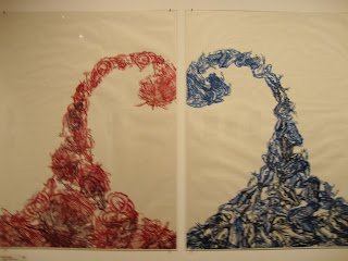

I went to Highpoint Center (a place more for printmaking) on Friday, September 11th to an art opening as well as a magazine preview party (with Chandra and Kevin). After being lost in Minneapolis for about an hour, we finally (by chance) came across the street which the gallery resided at. Ironically, we made it on time at 7:00pm. But of course, we were unfashionably early and no one was there... above is one of the main pieces in the show.

Anyway..

Post-Modernism:
(This chapter was hell to understand, but what the heck..)
"This is pornography..." by Pink Porcupine

This is an ink drawing by a very talented artist who goes by the name Pink Porcupine. She drew what seems like a an older woman harvesting the insides of a (hairy) man and showing a younger siamese boy(s). Bugs flock the grasped organs as well as birds feasting at them. It has a very motherly feel, yet it is grotesque and shocking at the same time. Not something you witness or hear about everyday.
As far as I am aware, the artist does her artwork as a self-therapy and responses to certain things. This particular piece was done in response to her art being banned from an art website, by the reasons of the admins saying it was pornography (whereas she did not believe it was, and I agree). Knowing this, I get the feeling of anger and satire.
So is this art? I personally believe it is. Some scholars believe there is no real art in this "post-modern" era. I have no personal opinion about labeling what time period an art piece was made in, but if someone is claiming something is not art (especially art made in the present times), then I'm offended. Yes, I do have the mindset that practically anything can/is art because I was born in the "post-modern" era. It all depends on the interpretation of the artist though, not only the viewer.

Views on art is all personal opinion. Scholars don't do shit but label everything. End of story.
/end assignment.


Here's another piece by the same artist:
"Two Roosters Fighting"
I think her use of medium, menstrual blood, is very unique. Here's a similar artist being creative with his medium: http://www.jordanmckenzie.co.uk/spent.htm

Have fun!
-J

Thursday, September 10, 2009

Intro

Blog for Orientation to Art and Design (OAD).

My other blog is http://junkoart.blogspot.com/ though it needs work.

Had a wonderful weekend with Chandra and Steven! We (sort of) did homework and played Blind Body Bowling and went to a gallery opening :) Buddy grouuuuupppppppp uniiiiiittteeeeee!

Have a great day.
-J